THE FIRST SIP
COFFEE HOUSE
Tasked with crafting a vibrant and distinctive brand identity and package design for The First Sip coffee shop.
This comprehensive project encompasses the creation of designs for various elements including:
- menus
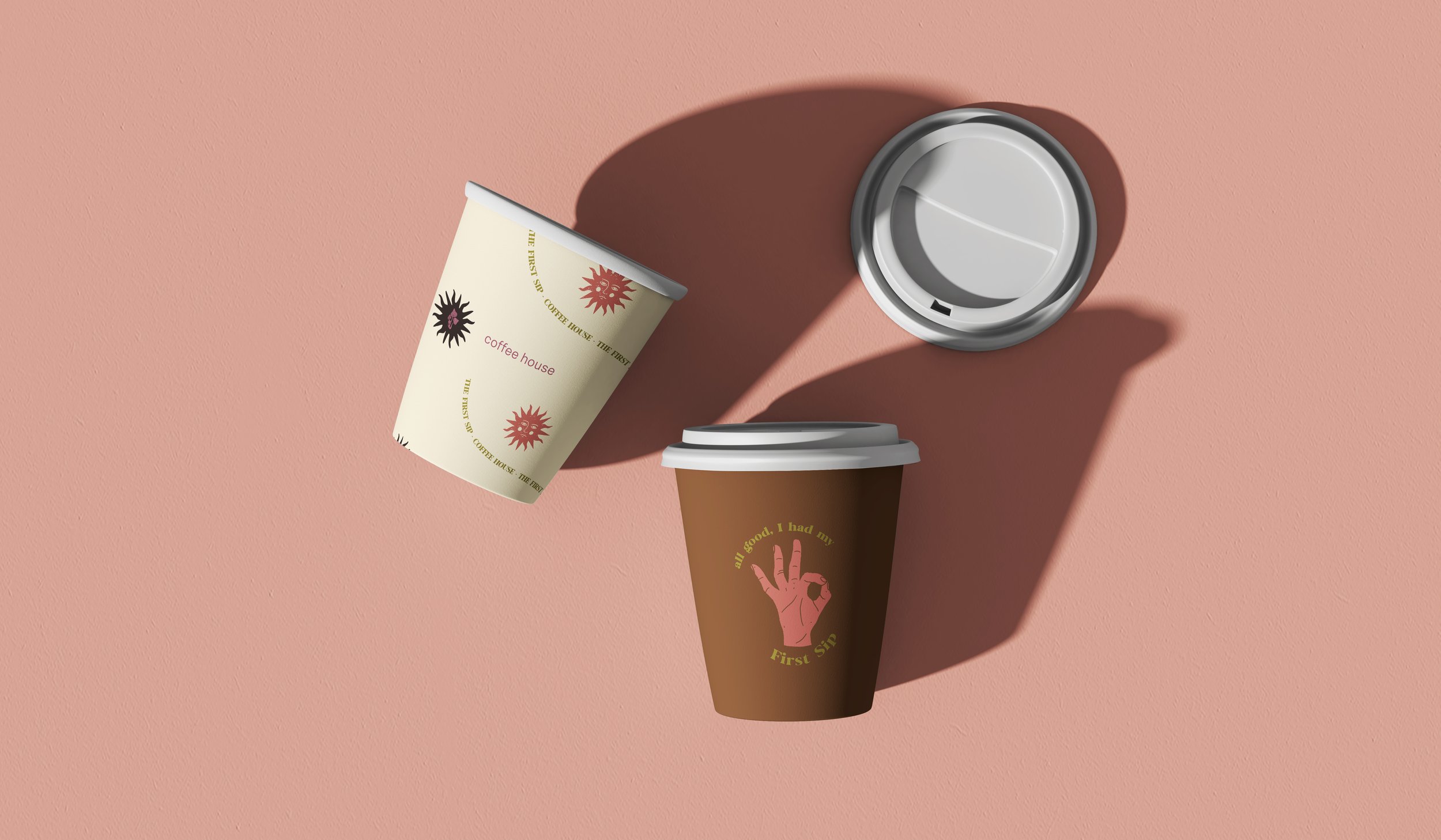
-cups
-carriers
-coffee bags
- MERCHandise: totes/stickers
Responsibilites
+ Design
Print
Packaging
Identity
+Brand Direction
brand guides
message
The intended brand persona exudes a sense of playfulness, confidence, and artistic flair, achieved through the incorporation of expressive fonts and captivating graphics. To further distinguish The First Sip within the competitive market, a bold and engaging color palette was employed.
The Process
I began by creating an AI brand brief to guide the deliverables to be created. With this, keywords were generated to hone in on the brand identity.
Playful | Eccentric | Artisinal| retro
But first, color.
I love color. The most exciting part of building a brand identity for me is finding the colors that will help tell the story. I chose playful, retro, yet grounding tones to remind us of coffee and mushrooms, the key product by The First Sip .
Using our keywords, I started putting together illustrations that felt hand drawn, eccentric, and gave the impression of a good time.
I wanted these to play a role in all print deliverables. From the menu, to cup holders, and tote bags.
With a color palette and illustrations in tow. I sought out to create font pairings that felt fun yet legible. I used a combination of a large display font with glyphs, script, and san serif type.


